
Client
Pale Blue Dot
Project
Brand refresh
Services
Identity design
Web design
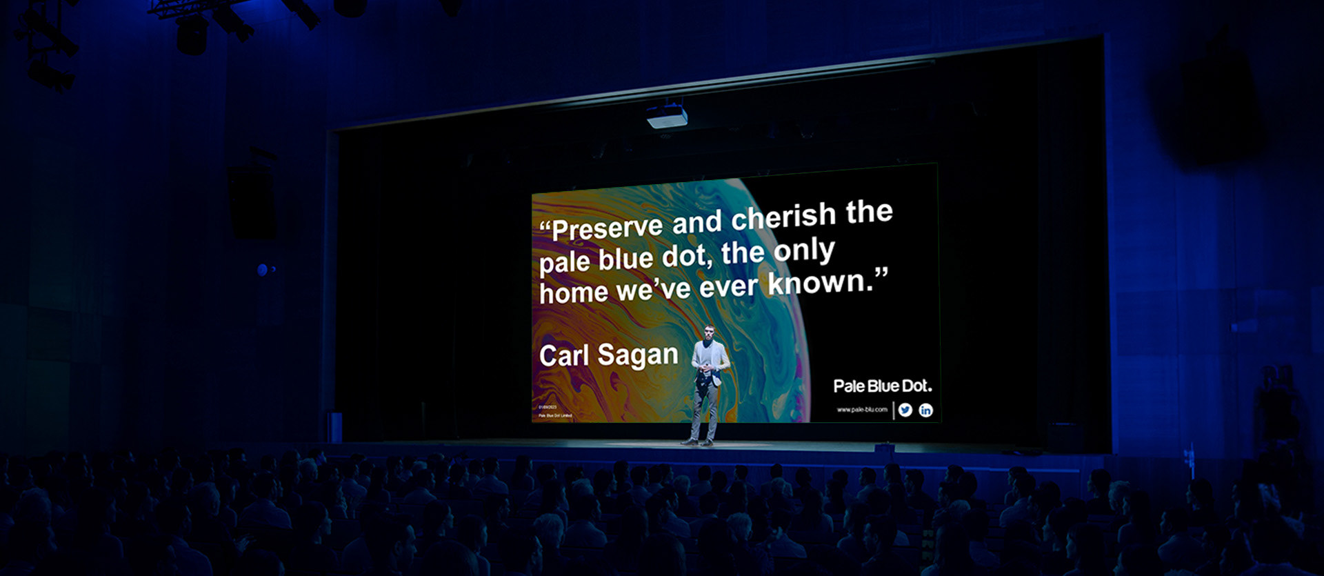
Pale Blue Dot are an Energy consultancy based in the North East of Scotland. They are paving the way for the Energy transition; converting existing oil and gas legacy infrastructure to accommodate Carbon Capture and renewable energy initiatives.
Named after Carl Sagan’s historic quote about the view of Earth from the Voyager probe, Pale Blue Dot are on a mission towards the energy transition.
With larger clients and collaborations, they required a brand, a website and some expanded graphics to show how far they had come..
____
This project was produced while working as a freelance graphic designer.

The Logo
The previous logo requires some minor tweaks and additional versions. The main logotype was recoloured to one bold punchy blue as the different shades of blue for each word split the logo up. An additional version was developed with the short logotype logo inside a blue dot; this was useful for when the business was credited in a presentation or report.
The Identity
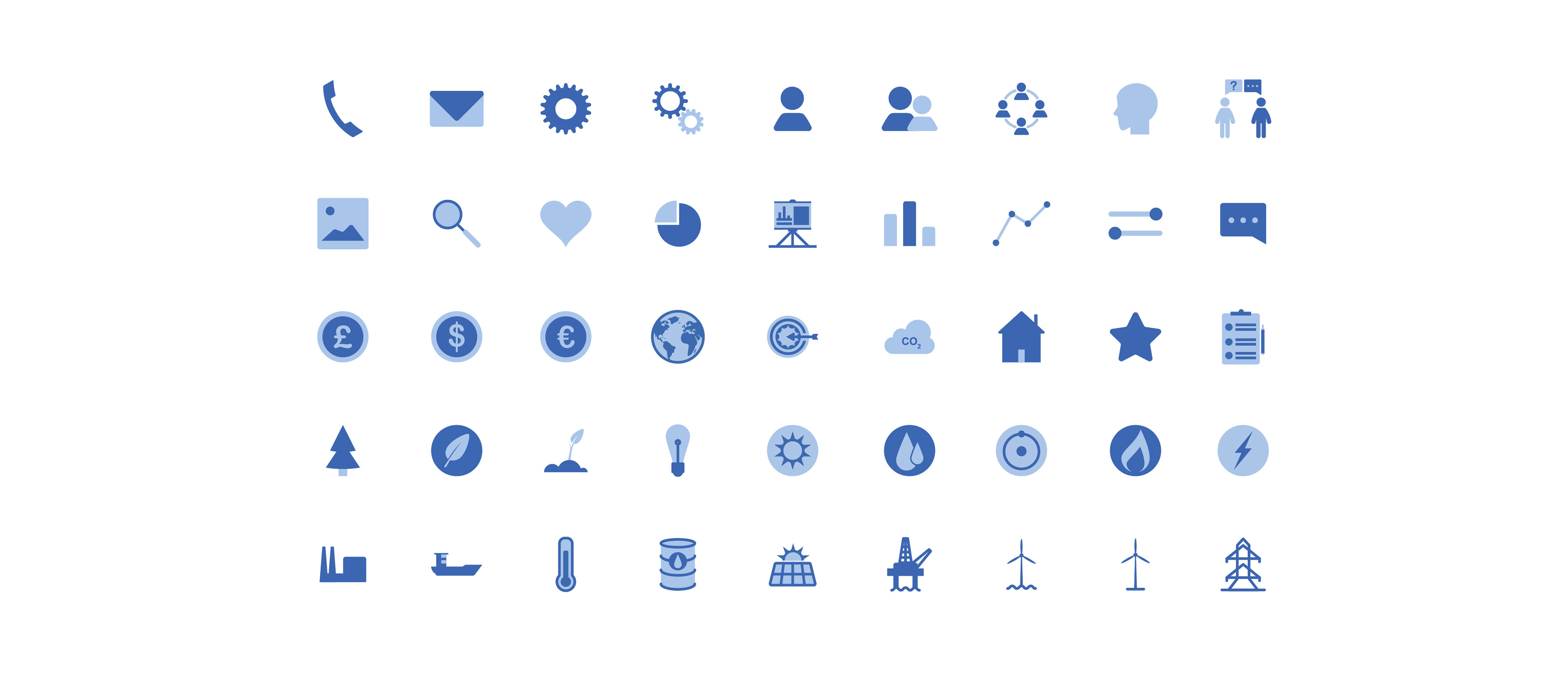
A suite of icons were created using the 3 shades of blue. Many icon sets share similar icons with the same meanings. The real challenge here was to produce bespoke icons showing industrial and energy processes not everyone would know about.
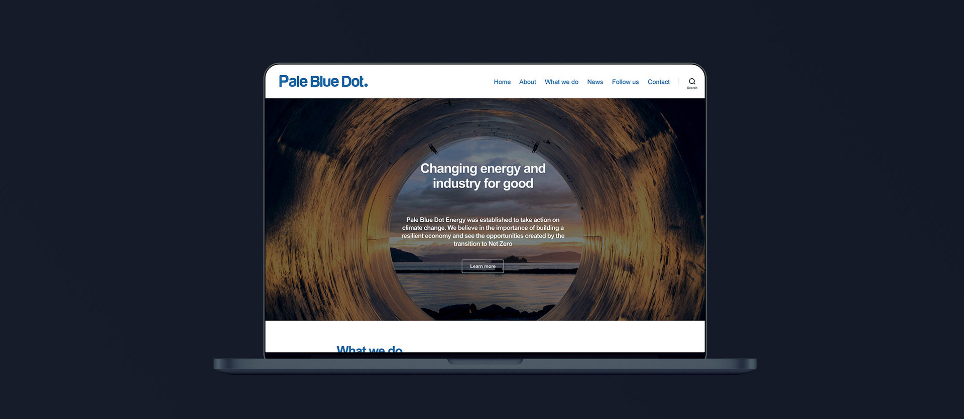
The Website
The website was developed on Wordpress due to due the teams familiarity with the Wordpress system. As I’ve been involved in projects with the client previously, I was able to push much of that work to the new site and populate the pages with new imagery, blog articles and services pages. This meant when it came to launch, the site hit the ground running.