
Client
Everyday Exploring
Services
Logo design
Web design
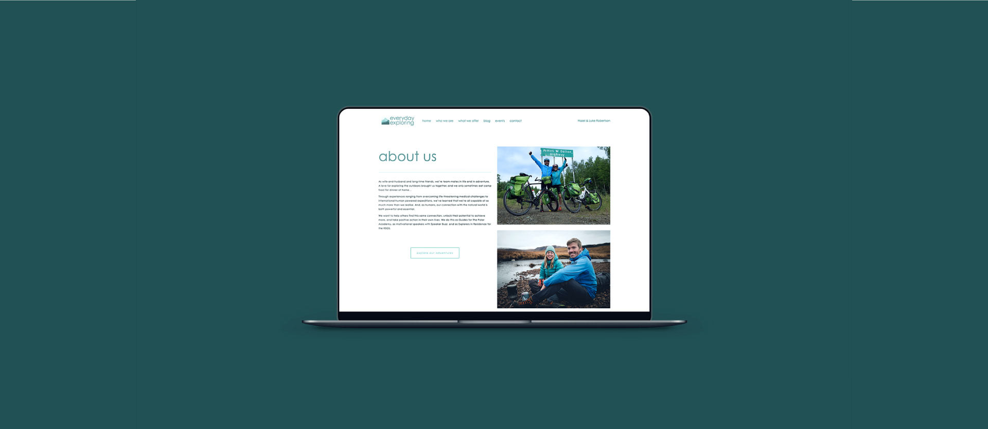
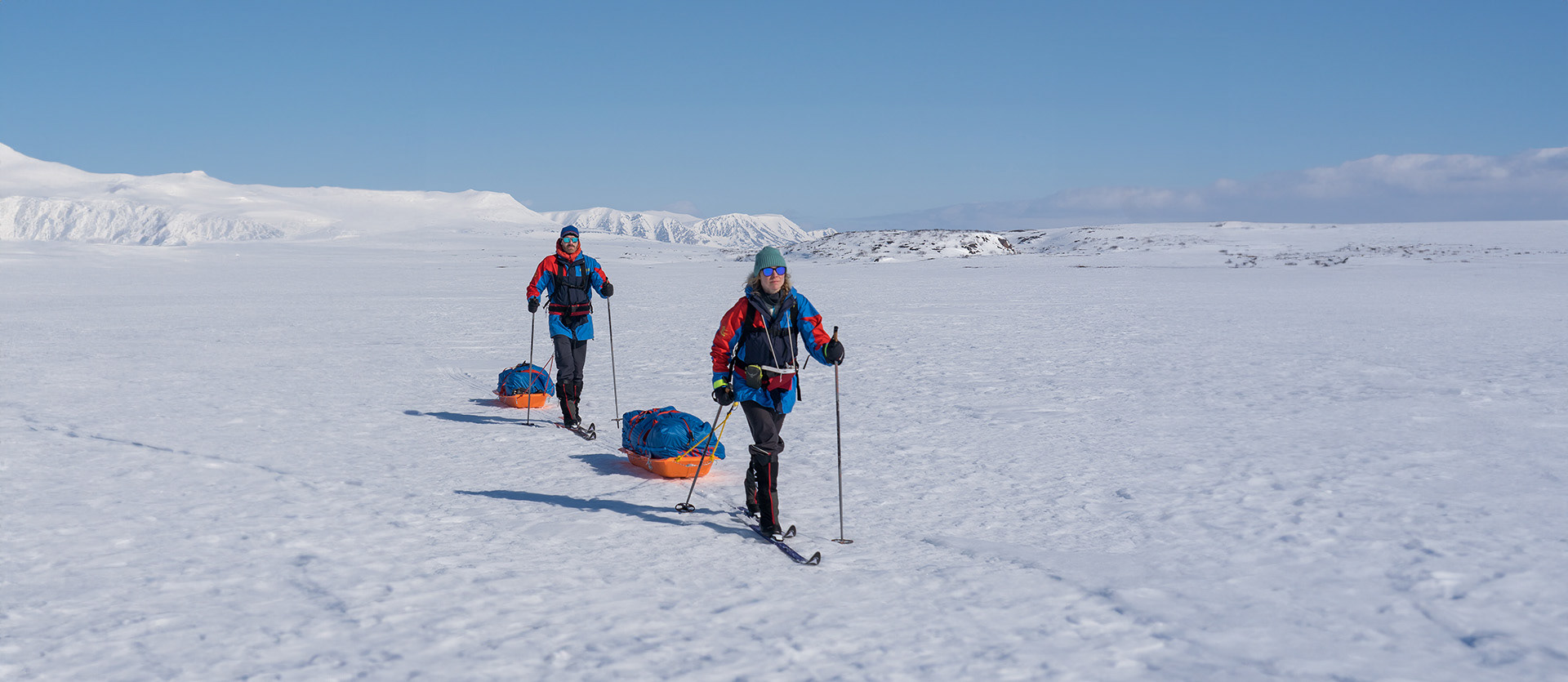
Everyday Exploring strives to encourage the explorer in all of us through speaking, workshops & guided outdoor experiences. However without an identity or an online presence, they wouldn't get far.
Luke & Hazel, the husband and wife team at Everyday Exploring had been doing offering workshops and talks for a few years now. They really needed a creative eye to help them setup a website and produce a logo that captures who they are.
____
This project was produced while working as a freelance graphic designer.
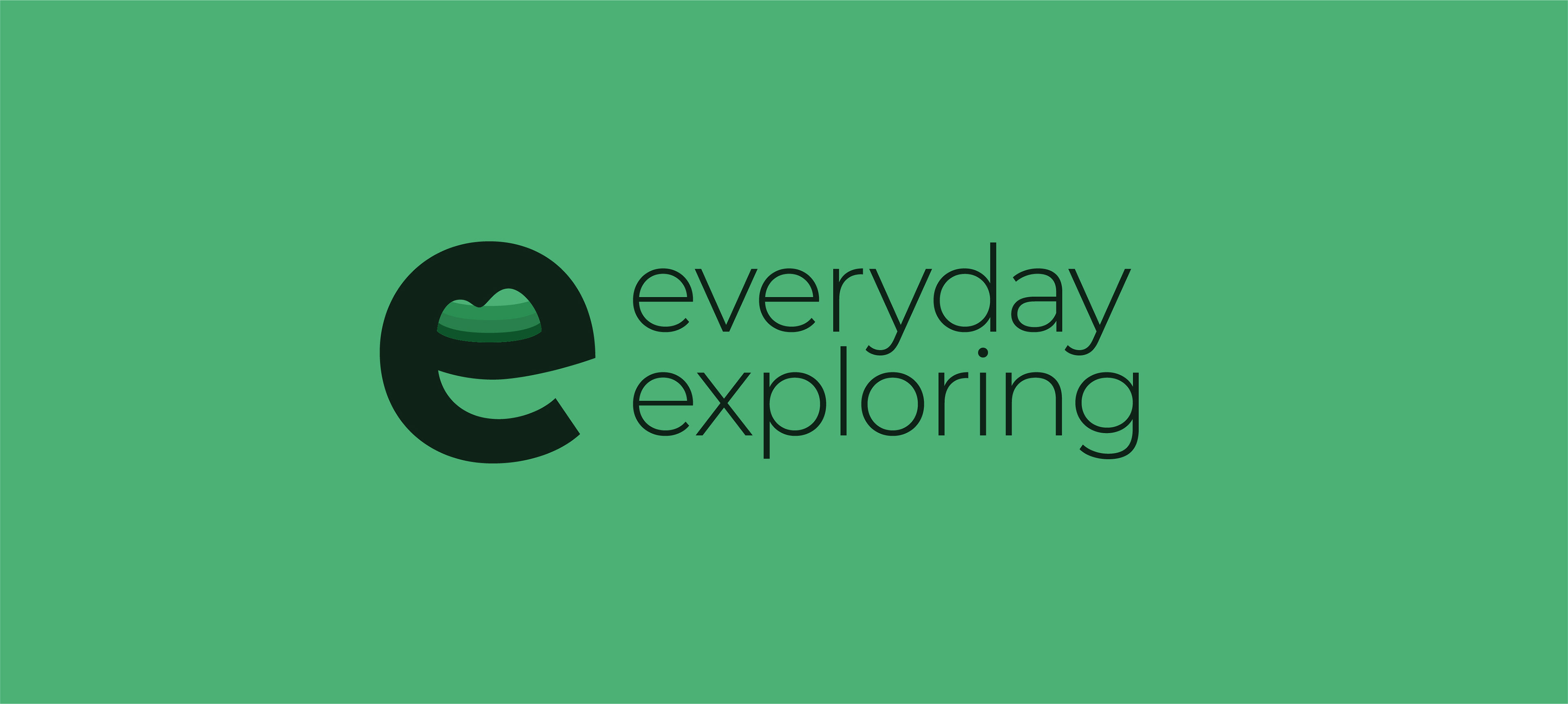
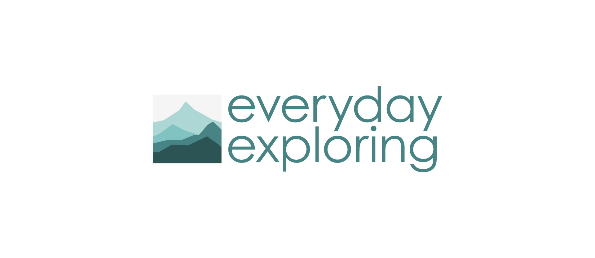
Logo Concepts
Two concepts started to take shape from my initial research. The first explored hill and mountain motifs inside custom typography as a monogram. Secondly, I applied it in a minimal way to the logotype. The client preferred this subtle approach and was developed into the final result.
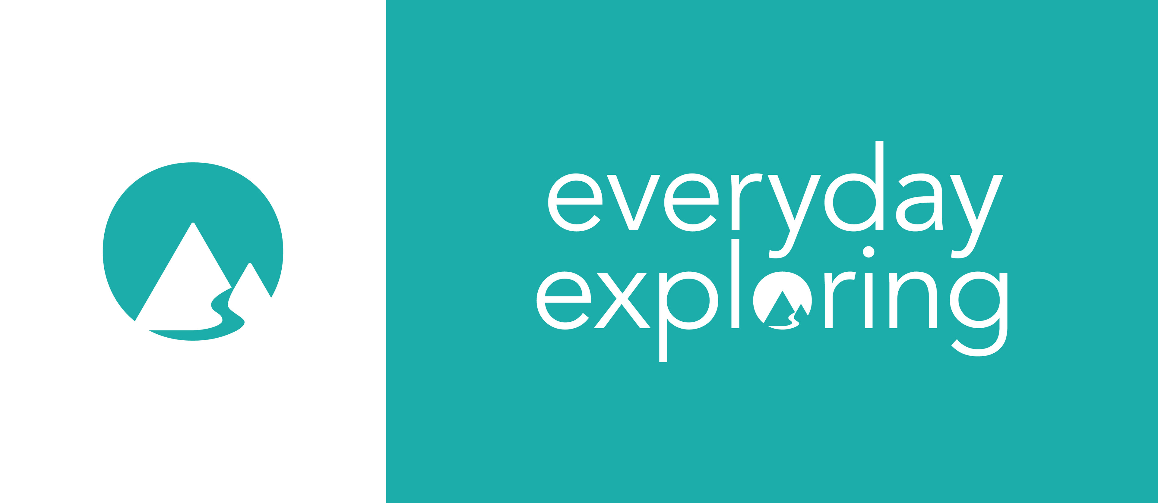
The Identity
The identity system was kept minimal to ensure flexible and consistant use by the both Luke & Hazel. This meant not complex rules or specific uses for colour. The monotone teal palette feels calming yet inspirating and creates a sense of distance in the logo. Orange highlights are used to pick up items of importance such as hyperlinks on the website. Finally, the visuals are paired with the geometric typeface Century Gothic for a clean look.